The thing that stands out most about their presentation is their emphasis on cooperation. The collaborative methods used by them created some pieces of art that are very monumental yet lively. The paper craft (more like paper monsters when their size is considered) created allows for a lot of variety in their work; so much so that the excitement in viewing is furthered by winding forms and shadows created from overlaid paper.
I'm not much of a sculptor, but i can appreciate the work they create.
Thursday, December 10, 2009
Artist lecture Review: Janice Koplos
Although Janet Koplos was not a full fledged artist and more of an art critic, she presented some interesting ideas about the creation of art. She stressed the process over the final result and provided images and videos of her examples. Unfortunately a lot of the shots themselves had no in-proccess shots, or were shot without close-ups, so it is hard to judge the validity of some of the artwork.
Still, i couldn't help but think about how much of the works of art presented reminded me of the process of creating animations. The work that goes into a minute of animation is so great, yet it is easy to forget how much time goes into creating such content. Animation is all about process, so much so that it can make or break a cartoon depending on the level of commitment.
Still, i couldn't help but think about how much of the works of art presented reminded me of the process of creating animations. The work that goes into a minute of animation is so great, yet it is easy to forget how much time goes into creating such content. Animation is all about process, so much so that it can make or break a cartoon depending on the level of commitment.
Tuesday, December 1, 2009
Current Progress on Final:
CURRENT PROGRESS:
According to my calendar, i'm on schedule for completing my final project this semester. All of my animations are complete, and I'm now currently in the compositing/rendering phase of production.
Despite everything, i still had my share of problems. None of my animations would render out with an alpha channel for compositing for one. This was a problem that set me back a while, until i figured out a workaround using AE's keying system to key out a solid color from everything.
Currently all of my assets and animations are finished. My dvd shows my current progress on my project; laying scenes and animations on each other, albeit still rough at this point. The timing isn't finished, and my current workaround is causing my animations to come out a bit fuzzy.
Hopefully the direction I'm working towards comes across on my dvd.
Tuesday, November 24, 2009
Pre-Thanksgiving Update:
Current progress:
I originally had this thursday set as my finish time on the animation portion of my final. However, considering the fluidity and timing I want to achieve with my hand-drawn animations, the process is taking longer than expected. Luckily I've planned for such a thing in my calendar.
This way, i give myself more time to complete my animations without falling behind.
(Edit: It's been confirmed that the school will be closed most of Wednesday and Thursday. I'm going to work as much as i can, and work on my dvd at home during thanksgiving holiday.)
Beyond that, ALL of my assets are completed. Here is a list of the new ones below:
--------------------------------------
I originally had this thursday set as my finish time on the animation portion of my final. However, considering the fluidity and timing I want to achieve with my hand-drawn animations, the process is taking longer than expected. Luckily I've planned for such a thing in my calendar.
11/19: 4/5 of all assets completed. Begin animating project.
11/24: Continue animating project. All assets should be complete at this point.
11/26: Animation finished. Any tweaking to each scene completed by 11/29.
11/30: *****Rendering from the 30th thru Dec 2nd. Extra time given in case of mistakes, errors, or unforeseen circumstances.*****
12/3: final revisions to animation done. rendering completed. begin working on class DVD.
12/7: extra time given for unforeseen circumstances.
12/10: last day of class. dvd turned in.
The time between 11/26 and 11/30 as well as 11/30 to 12/3 was padded with extra time for rendering that I know I will not need in case of unforeseen events such as this.. (I'm working with vectored graphics and movie clips; I doubt a whole week is needed for rendering.) So I'm reorganizing my schedule just a bit to compensate, where I lower the amount of days i have to render to continue animating.11/24: Continue animating project. All assets should be complete at this point.
11/26: Animation finished. Any tweaking to each scene completed by 11/29.
11/30: *****Rendering from the 30th thru Dec 2nd. Extra time given in case of mistakes, errors, or unforeseen circumstances.*****
12/3: final revisions to animation done. rendering completed. begin working on class DVD.
12/7: extra time given for unforeseen circumstances.
12/10: last day of class. dvd turned in.
11/19: 4/5 of all assets completed. Begin animating project.
11/24: Continue animating project. All assets should be complete at this point. (begin working on class DVD.)
11/26: Continue animating scenes.
11/30: Animations should be complete by this point. Compositing should be in-progress.
12/3: final revisions and compositing to animation done. rendering completed.
12/7: extra time given for unforeseen circumstances.
12/10: last day of class. dvd turned in.
This way, i give myself more time to complete my animations without falling behind.
(Edit: It's been confirmed that the school will be closed most of Wednesday and Thursday. I'm going to work as much as i can, and work on my dvd at home during thanksgiving holiday.)
Beyond that, ALL of my assets are completed. Here is a list of the new ones below:
--------------------------------------

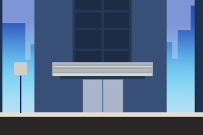
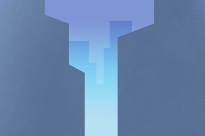
The building where the climax of the animation takes place has three parts the first part is pictured above.
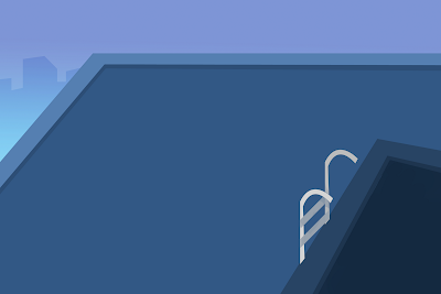
Part 2: A bit higher up.

Part 3: Waay higher.

There is an extra shot within the building, where we see him ride the elevator to the top floor.
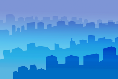
Cityscape used for the building shots from above.
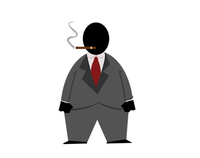
I revised the CEO, adding a shirt tail and cigar while removing the neck and gold lapel. I agree with the class, and think he looks a lot more 40's greedy-ish this way.
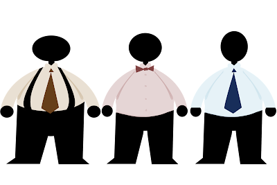
These are the extras that i use to populate the city in my animation. There will be color shifts, so there is more individuality between them, but they are all made from these three. I know the neck on the CEO seemed akward, but no one seems to mind it on my main character (maybe because it was thicker?) so the extras have necks as well.

Part 2: A bit higher up.

Part 3: Waay higher.

There is an extra shot within the building, where we see him ride the elevator to the top floor.

Cityscape used for the building shots from above.

I revised the CEO, adding a shirt tail and cigar while removing the neck and gold lapel. I agree with the class, and think he looks a lot more 40's greedy-ish this way.

These are the extras that i use to populate the city in my animation. There will be color shifts, so there is more individuality between them, but they are all made from these three. I know the neck on the CEO seemed akward, but no one seems to mind it on my main character (maybe because it was thicker?) so the extras have necks as well.
-----------------------------
Finally, I have a preview of the first 22 seconds of my animation, except for empty spaces where backgrounds or set pieces would appear along with the animation. There is a green alpha channel on it currently to make it easier to see parts that are working and mistakes. Beyond finalizing the timing and tightening up a few sequences, I am getting a good idea of where areas need improvement.
I've been animating him with a certain level of fluidity and looseness in design that I hope will have him stand out from the static, geometric environment he works within. I know that my scenes are not composited yet, but from looking at this in comparison with my environments, is it working? Is it not? Should I tighten my animations to better represent my conceptual art and character designs?
While I am far along into my final, I'm not so far that i am unable to make revisions and improvements to my animations. Any and all comments would be appreciated.
DI Final: Preview 1 from Michael Shaw on Vimeo.
Thursday, November 19, 2009
Critique Response:
It seems as though my aesthetic is working well, save for the CEO, who needs to be revamped. I agree with the comments made during class, and think the cigar may help. Should it also prove ineffective, I'll experiment with other methods of portraying his greed.
Other than that, I'm practically done with all of my assets. I have my cityscape and crowd to finish by tuesday. Beyond that, I will start animating today and should have good chunk of the animations in each scene done by thursday.
11/19: 4/5 of all assets completed. Begin animating project.
11/24: Continue animating project. All assets should be complete at this point.
11/26: Animation finished. Any tweaking to each scene completed by 11/29.
11/30: Rendering from the 30th thru Dec 2nd. Extra time given in case of mistakes, errors, or unforeseen circumstances.
12/3: final revisions to animation done. rendering completed. begin working on class DVD.
12/7: extra time given for unforeseen circumstances.
12/10: last day of class. dvd turned in.
I currently have next thursday as my date to accomplish all of my animation. Should something happen however, i've given myself an extra few days to finish the day we come back from break. Either way, the next week is dedicated strictly to animating, and then compositing my animations and backgrounds in After Effects.
-------------------------
For tuesday, I want to have as many animations as possible to show, ALL of my assets completed, and a revised CEO design.
Final Update: All but 2 assets built (+ motion test)
Here are the additional assets i've made since tuesday. I have most of my set pieces done, only missing my extras for my crowd, and the cityscape for the final scene. (still doing research for its composition.)
Backgrounds:
----------------
Objects and characters:

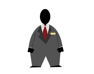
Ceo. Here is his current design. Is he working? Does he seem to be the main character's superior?
-----------------
I also did a test in After Effects for the flash animations i plan to start working on today. I needed to make sure that I can effortlessly attach individual textures on characters independent of the background, and together. It took a couple of tries, but I ended up finding a way to make them work. All I have to do is parent the texture, and the layer of animation to each other, set the texture layer to overlay, the texture itself to a luma matte, and the layer to an alpha matte. They matte each other, and work together as if i layered them together in photoshop.
Everything is coming together well. I can begin animating today. I plan to have them all finished by next thursday.
Backgrounds:

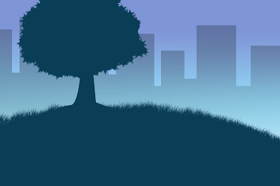
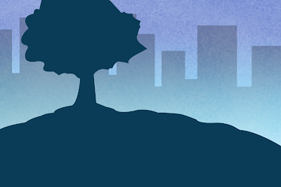
Field with tree. I wonder if i should add more variety in colors, the solid ground seems to be working for this...

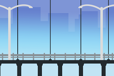
Bridge
----------------
Objects and characters:

Bus; front, back, and side views. I like the detail on the headlights... I'm thinking about revisiting the taxi and adding the detail to those as well.

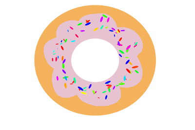
Donut.

Ceo. Here is his current design. Is he working? Does he seem to be the main character's superior?
-----------------
I also did a test in After Effects for the flash animations i plan to start working on today. I needed to make sure that I can effortlessly attach individual textures on characters independent of the background, and together. It took a couple of tries, but I ended up finding a way to make them work. All I have to do is parent the texture, and the layer of animation to each other, set the texture layer to overlay, the texture itself to a luma matte, and the layer to an alpha matte. They matte each other, and work together as if i layered them together in photoshop.
Texturing Test from Michael Shaw on Vimeo.
Everything is coming together well. I can begin animating today. I plan to have them all finished by next thursday.
Tuesday, November 17, 2009
Current Progress on Final:
My next milestone to meet is to have about 4/5 of my assets already created before undergoing character animation on thursday. I'm happy to say i'm currently about 3/5, of the way there, still working on my backgrounds, and only needing two more characters created.
My project utilizes a lot of compositing of static elements from photoshop and animations from (now), toonboom. I decided over the weekend it would be quicker to animate my scenes in toonboom as opposed to flash, then composite them with my set pieces in after effects.
I currently have completed backgrounds for the following scenes:
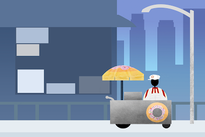
Donut stand.
Walk through crowd.
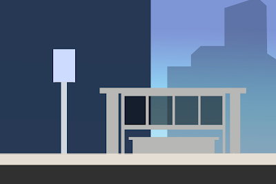
Bus stop.
I've focused more on the characters at this point, and have created
Main Character
Taxi Driver
Donut seller.
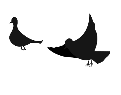
Bird
Flying Squirrel
I have also started on the vehicles and objects and created
Taxi (profile and rear view)
Donut stand
Viewfinder
I currently have the following left to do:
Characters:
CEO
crowd extras.
bus in profile, and from behind.
Backgrounds:
Finish tree environment.
Bridge chase environment.
Sprawling cityscape, including the large building climbed by the main character.
Extra:
The Donut
Some of the backgrounds are missing textures at the moment. I'm weighing the options of overlaying textures in after effects for this final, so i can utilize textures for my toon boom animations as well.
The creations:
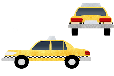
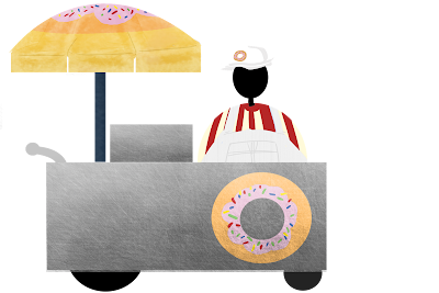
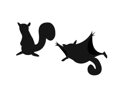

Main Character

Taxi Driver

Taxi Cab

Donut Seller and Donut Stand

Squirrel (flying)

Bird

Viewfinder

Viewfinder
---------------------------------
all backgrounds are in progress shots, missing texturing.
all backgrounds are in progress shots, missing texturing.

tree scene

bus stop

donut stand

the crowd (in progress)
Subscribe to:
Comments (Atom)
